The friendsite
I took goofy photos of my friends, coded a 48 page website, didn't sleep regularly, and cried three times while making this. But it was all worth it!
In 2015, I set out to create what was going to be the largest and most time consuming project for my senior exhibition piece; The Friendsite. This was a project where the concept was thought of a while ago. I always wanted to do a massive project and dedicate it to all the friends I made during my time in college, but it took me a while to figure out how exactly I wanted to carry it out.
Originally the project took on a few different looks before settling on a website. Originally I thought about making a long video collage with all my friends in it, which morphed into creating a large amount of printed squares with everyone's photos and bios on it displayed in a grid. Eventually I decided to combine all those ideas into a media where they could all work, a large friend website. Thus, the Friendsite was born!
Phase 1: Logo Exploration
A few early logo iterations that ultimately didn't make the cut.
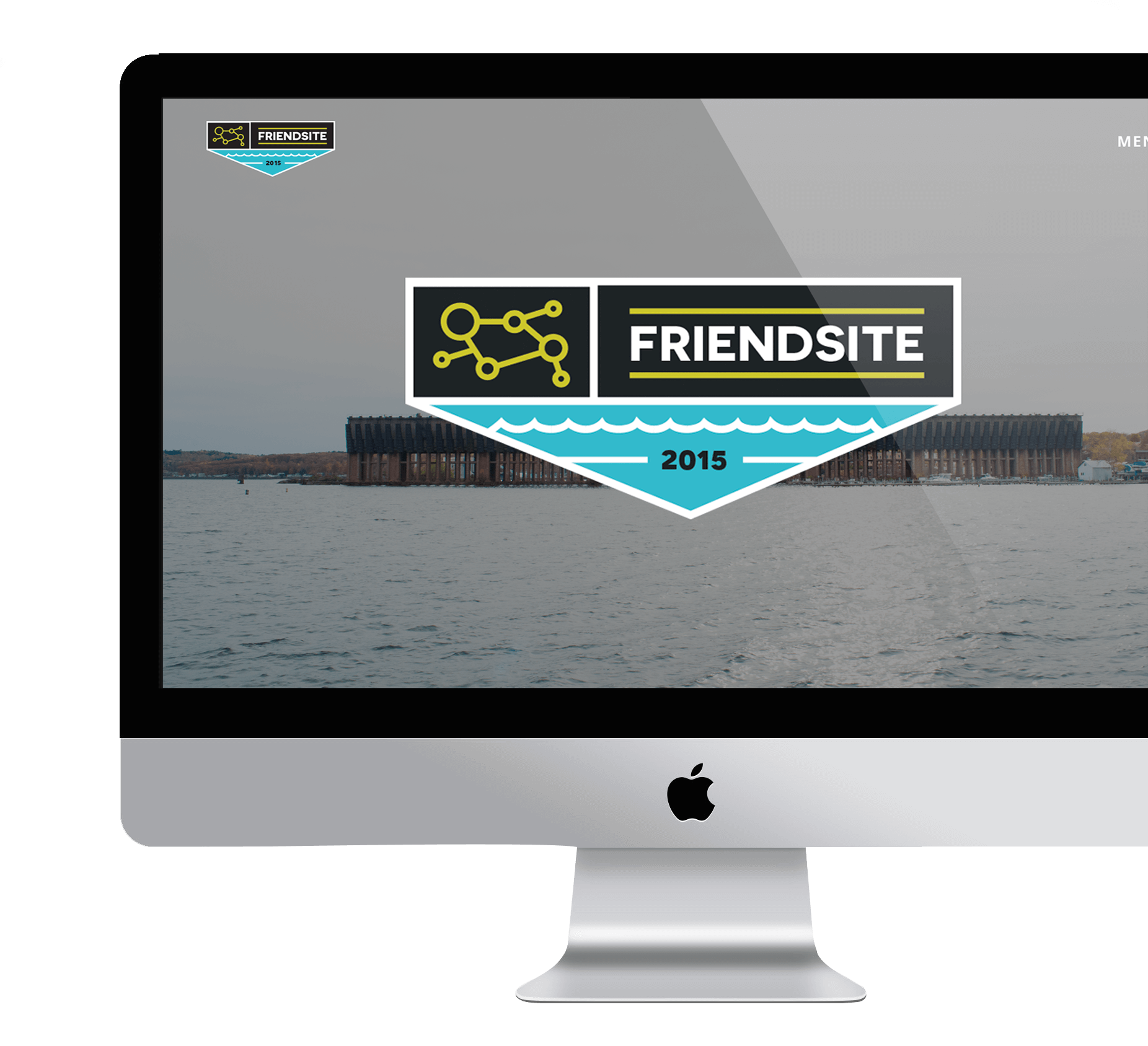
The final logo I ended up picking for my project. My advisor and I both felt it's simplicity, composition, and portrayal of the project's major themes were the strongest.
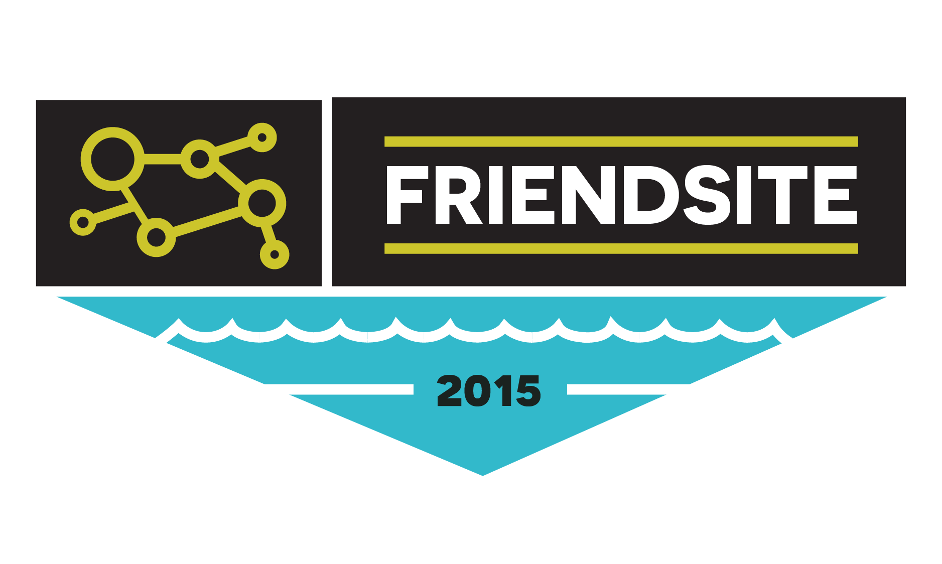
In the initial stages, I was torn between what exactly I wanted the logo to represent. Should it represent interconnectivity and evoke a sense of bonding? Or should it be more focused on the location where all of these friends were made; the Great white North? Or did I want the logo to be representative of the tools and technologies I was going to use to complete this project? Ultimately figuring out the logo would be figuring out the tone and the message that my senior show portrayed. After toying with many concepts for a bit and not being entirely swayed one direction or another, I decided that instead of picking and choosing, I should just combine everything I want the logo to represent into one.
Something that I think ultimately helped me narrow it down to this logo was the composition. I loved how each section of the logo stands out and is prominent in its own space, while also working together as a whole and contributing to the larger composition. I also felt the logo had the best balance when it came to color, spacing and type hierarchy as well. The sequence pattern on the left represents connectivity which is a huge theme throughout this project. In Marquette, everybody knows everybody, and you'd be surprised how many mutual friends you can have in common with another individual. The waves are reminiscent of Lake Superior; the heart and soul of the Upper Peninsula.
Phase 2: Photoshoot
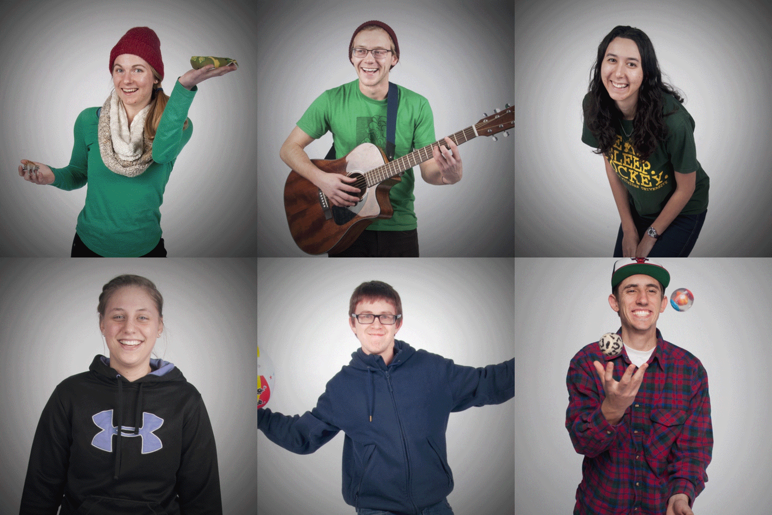
The 2nd phase of this project was getting original content and photos of all the different friends involved. For this part, in order to get portrait shots for my project, I knew I was going to need access to the photo studio (which I did not have) and I knew in order to get the shots just right, I would have to reach out to a fellow photographer if I wanted them to be badass! I teamed up with my good friend and talented photographer Sarah Reimink to help me capture my friends in their own element. After forming a facebook group and posting a consistent schedule on it for the next 12 weeks to let everyone know when and where they should show up, phase 2 had begun!
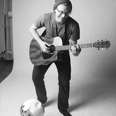
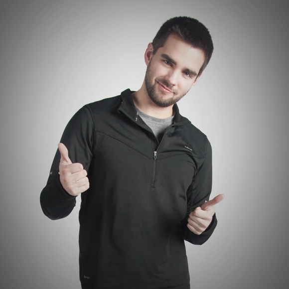
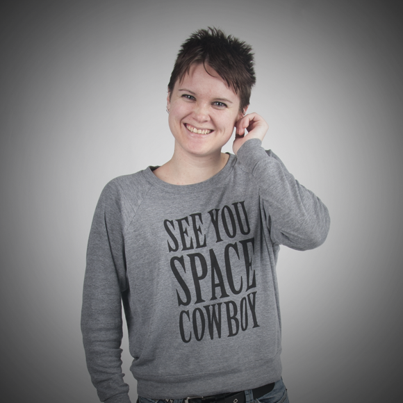
I had a lot of fun getting to direct the photoshoots, although most of it was just me throwing a beachball at my friends and trying to get them to laugh for Sarah.
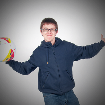
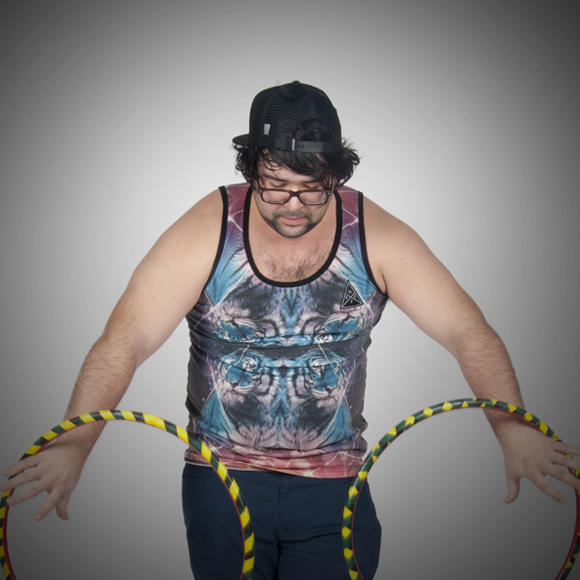
It was important to me that people felt comfortable being themselves in the photo, and that their portrait reflected their personality more than anything. While the studio had a variety of weird props (which many of the people ended up using in their photos,) there were a few friends who brought in objects that were special to them, and I really appreciated those who made their portrait their own.
This was my first time directing a photoshoot, and I can honestly say if it wasn't for Sarah's patience and expertise, these portraits would not have turned out as amazing as they did! I learned first hand the difficulties behind getting people to open up in front of a camera. There's always a sense of vulnerability when someone is in front of the camera, and I wanted to make sure that everyone who was being photographed could open up and be themselves. Luckily my humor proved to be valuable in getting people to relax and enjoy the process (and if all else failed, throwing the beach ball at their head seemed to get quite a reaction.)
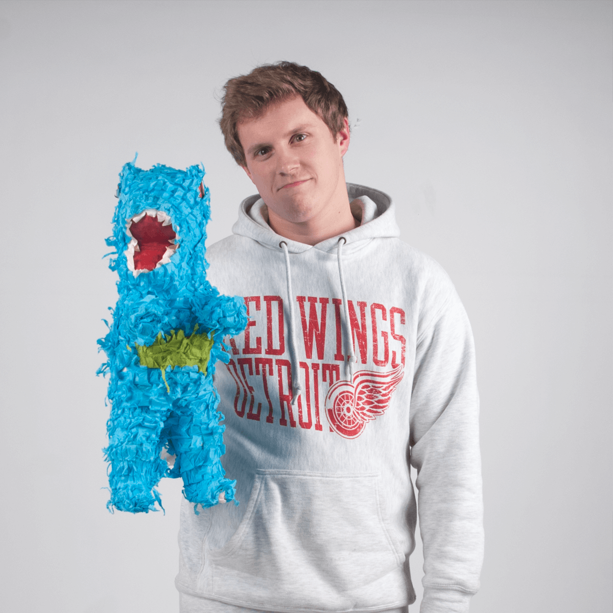
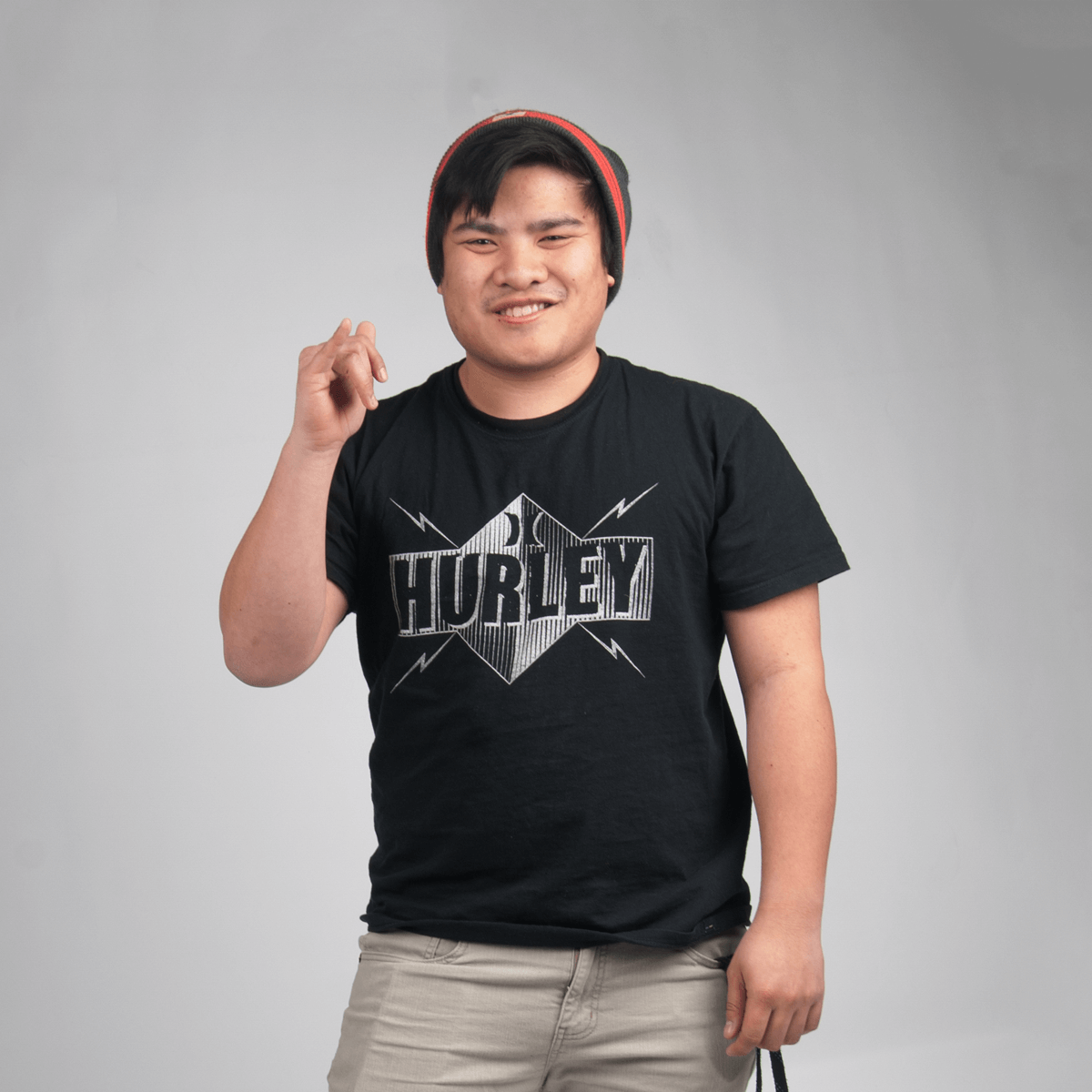
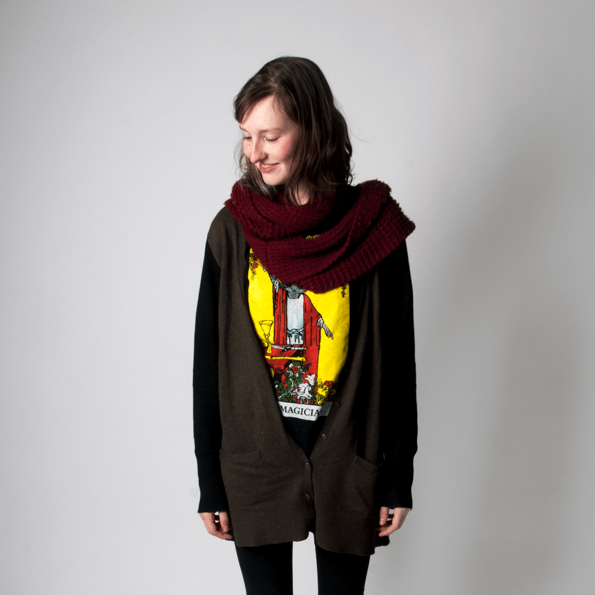
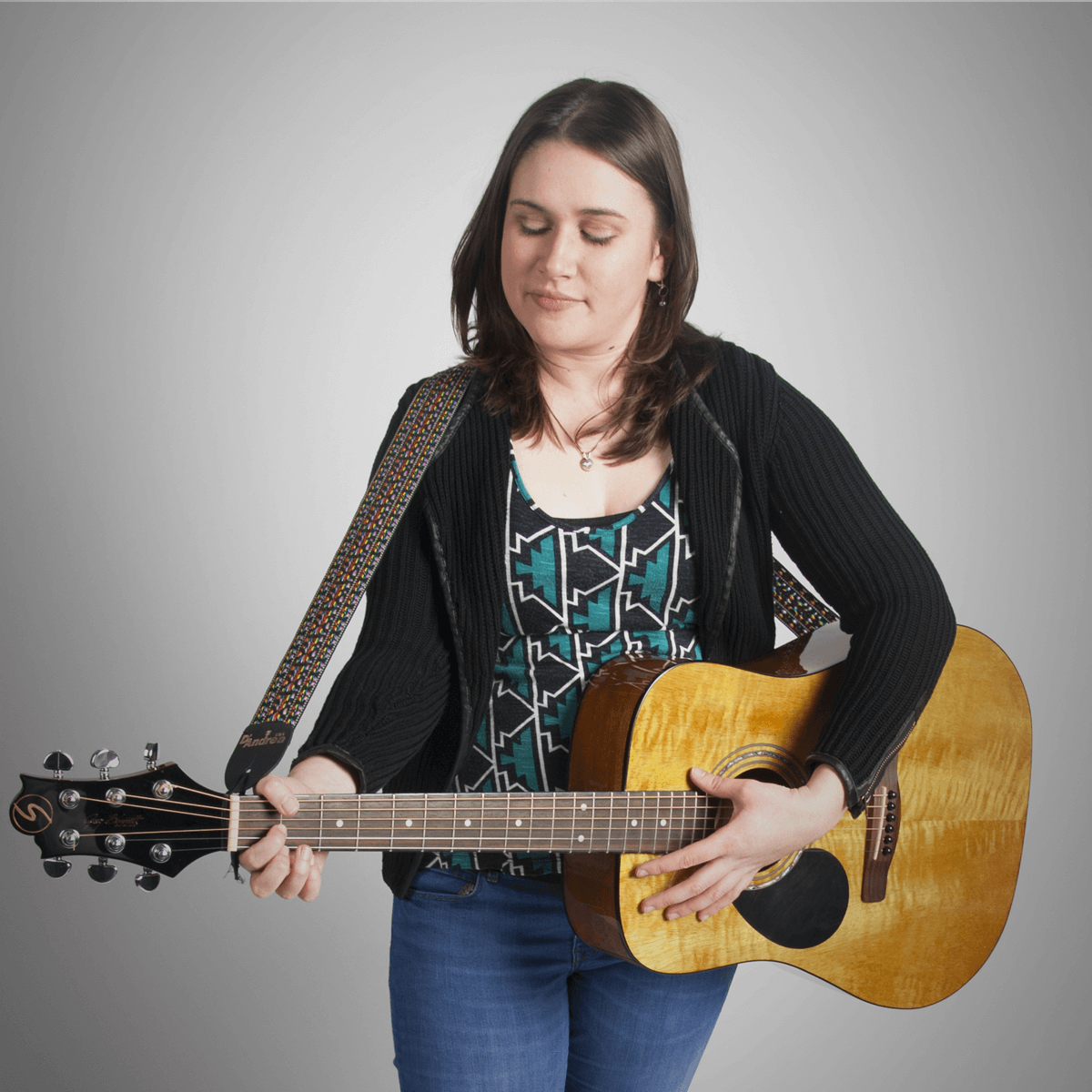
Over the course of 10 weeks, I managed to get 40 friends to show up and participate in this project. Who knew I had so many friends?
Phase 3: Website Design / Development
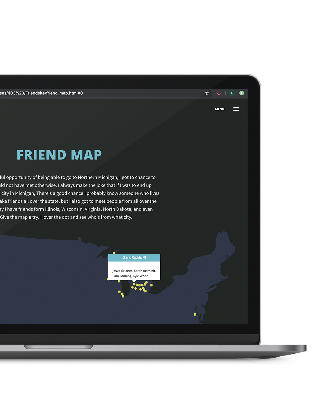
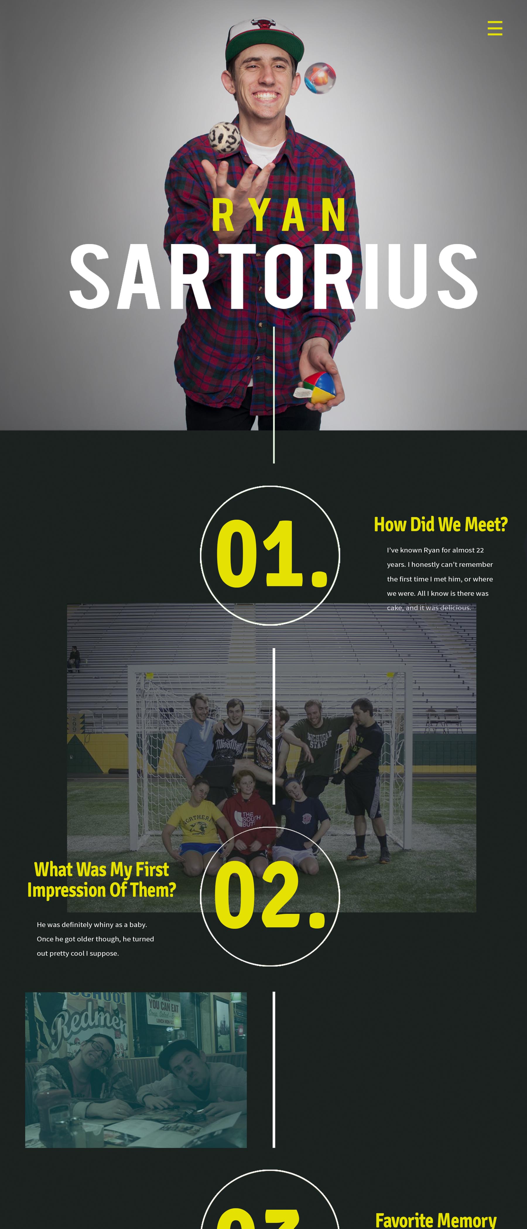
By far the most time consuming process, phase 3 was the design and development of the website itself. I started on a design before phase 1 or 2 even started. This was the part of the project that brought everything together. I wanted the website to have a modern day scrapbook feel with timeline elements laid throughout it to give it a feeling of nostalgia and progression. I also wanted to add personal memories and photos throughout each timeline to make each persons page unique to them. While the homepage mostly serves an overall summary of the project itself, what makes this project special to me and everyone in it is how every person's page is uniquely built and written for them based off our own relationship. Everyone who was a part of this has affected me in their own unique way, and it was awesome to go through and read everyone's own page once it was finished. My favorite part of the website though was the Friendsite map, an interactive map that lets you hover over people's hometowns and see who is from where.
The hardest part of the website was actually a couple different aspects. The first was getting the timeline to not only resize at every breakpoint, but also getting it to interact with everyone's photos that fade into the timeline. That part alone took about two weeks to get it looking nice at multiple breakpoints. The second part was actually writing everyone's personal message to them. Although I really enjoyed that this project allowed me to look back and reminisce on my time at Northern, I have to admit, it can be really difficult to put into words how much each of your friends mean to you. Picking just one friend to say something nice about can be hard enough, but now imagine having to do it with 40 different people? I would say at least 40% of this project was coming up with everyone's page information and personal message.
Homepage

Bio page layout

Countless all-nighters and so much collaboration went into this project, but I think that's what made it all so special to me. This website was definitely a labor of love that tested my patience at times, but if I had to, I would do it all over again in a heartbeat.
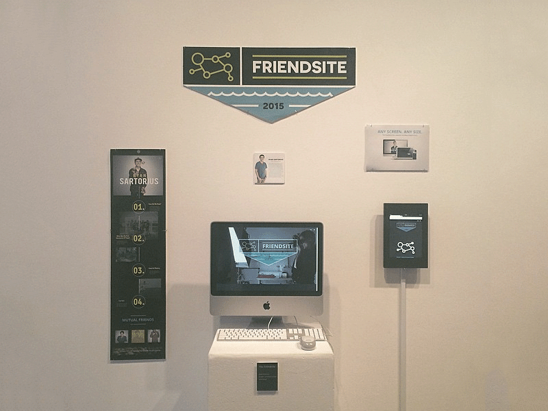
My senior exhibition project on display at the Wave 2015 Senior Art Exhibition Show. Even to this day, it is still one of my favorite projects and greatest accomplishments in my design career.
ryansartori.us
[email protected] | (734) 780 - 4795 | Kalamazoo, MI
Design by Ryan Sartorius, circa 2022. All rights reserved.
